L'Art de la défense

Client
L'Art de la défense
Services
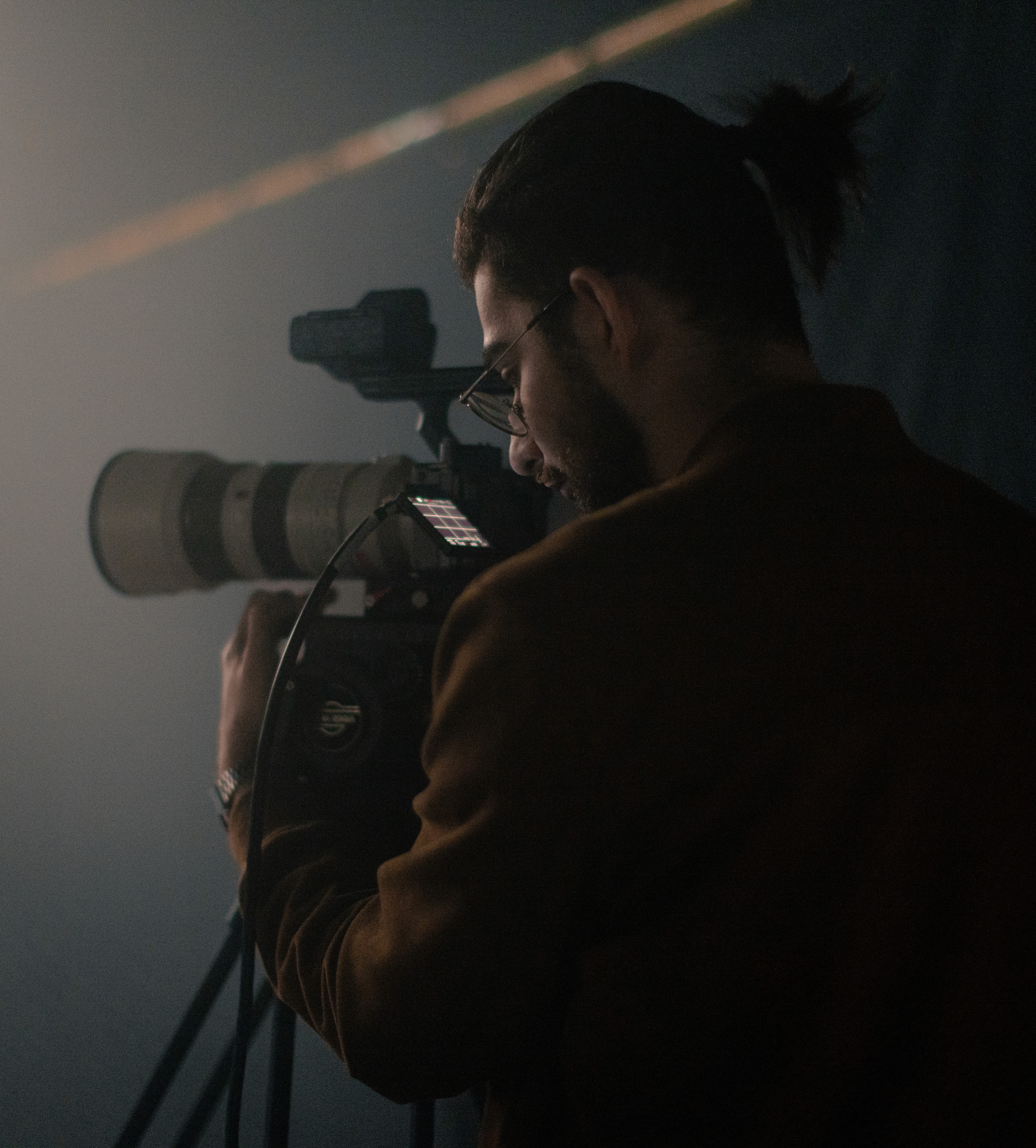
VISUAL PRODUCTION
CREATIVE STRATEGY
IN-ENGINE RENDERING
Industry
Defence
Year
2026
Infos
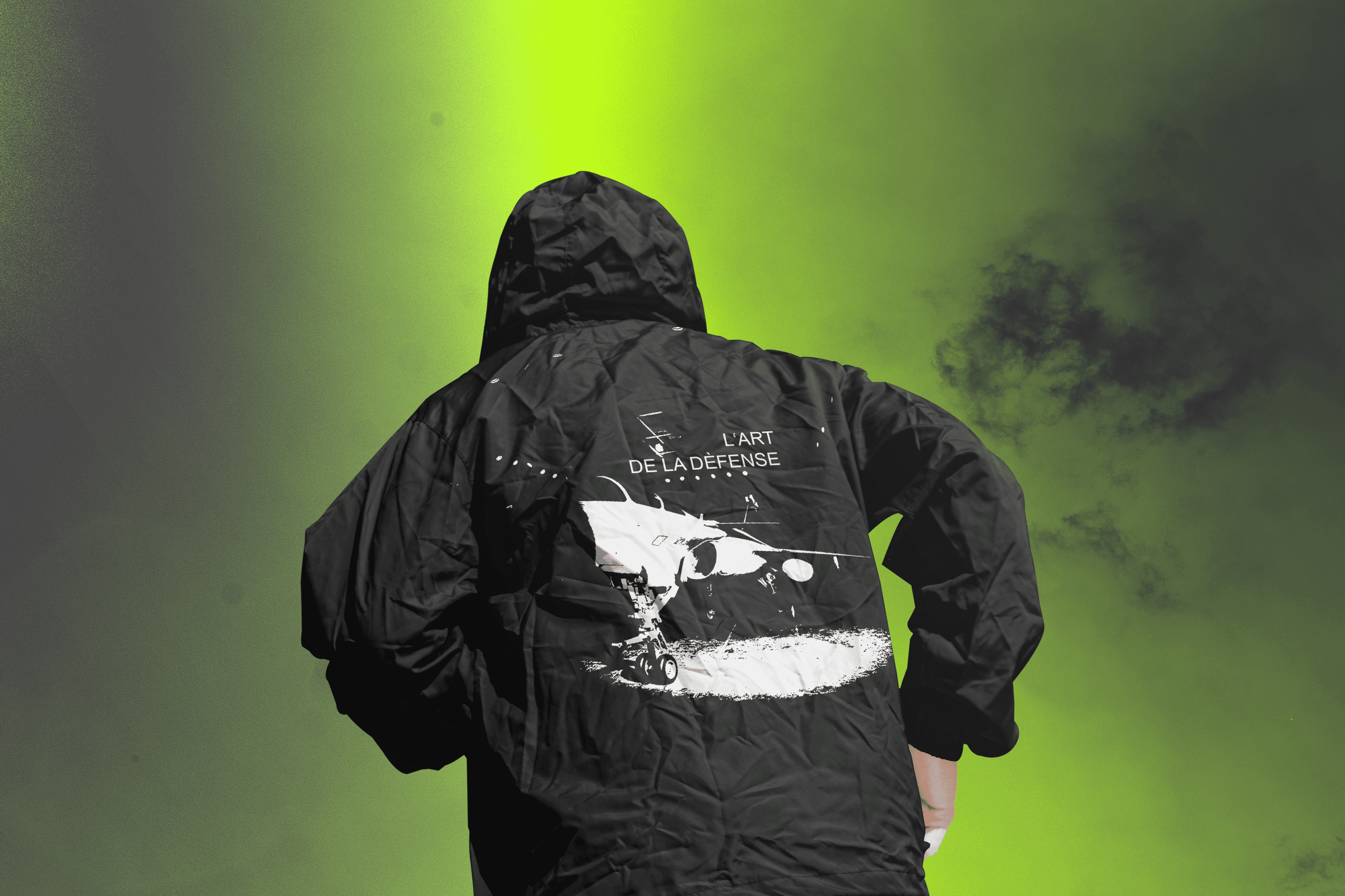
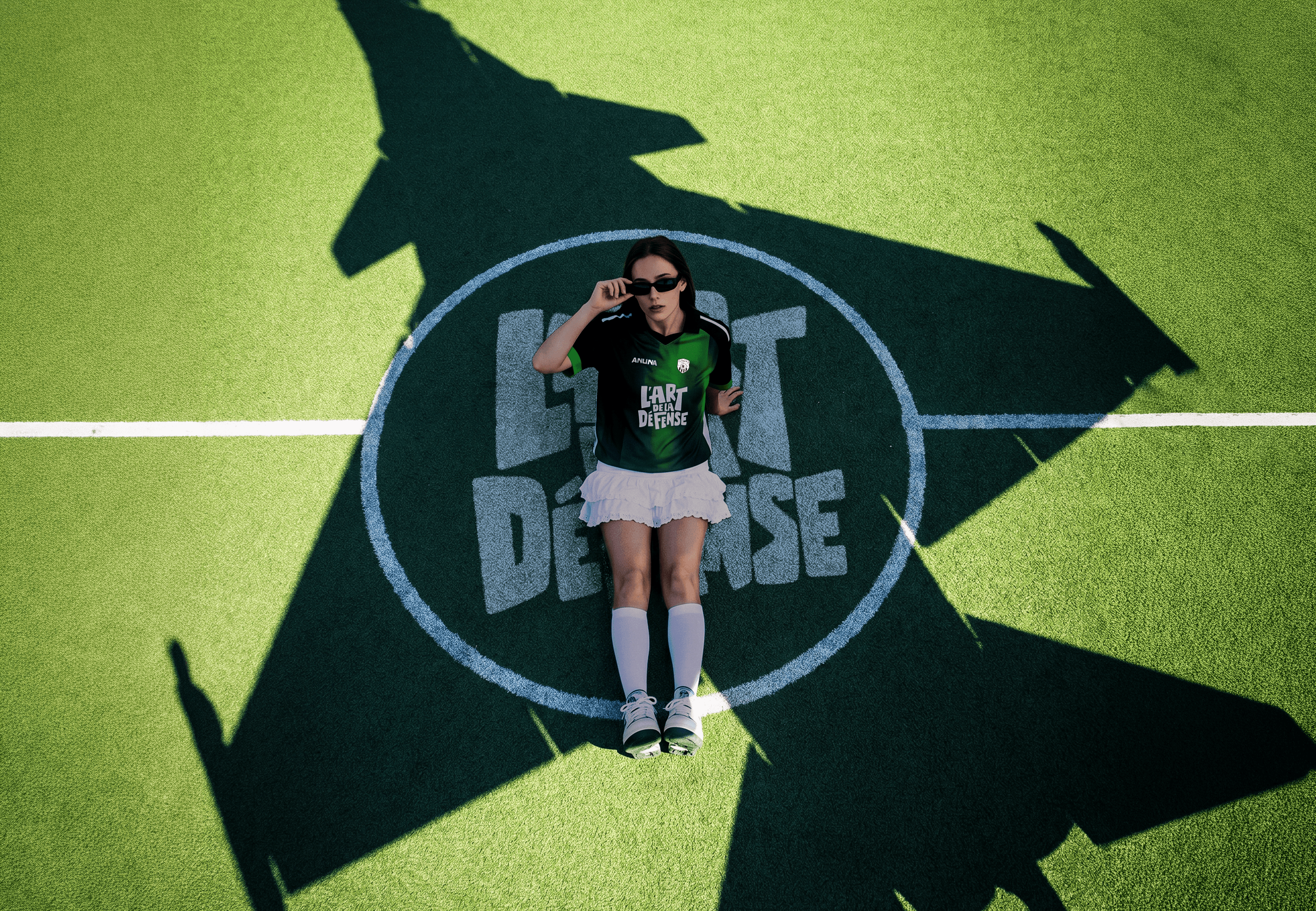
The first decision in any defence brand is the colour. The category has settled on blue. The same blue across every continent, against the same airfield horizons, set in the same family of trusted typefaces. There is nothing wrong with that blue. There is nothing right with it either. It is a colour chosen so no one has to choose. We chose a green nobody in the category would willingly approve. A chartreuse closer to HUD lighting, or a frame from a Tokyo streetwear brand, than anything that has passed a procurement review. It is uncomfortable in the right way. The colour does not appear on the aircraft. The aircraft stays grey, as it should. The green is the frame around it. The world around the object has a colour now, and it is not the one anyone expected. From there we stopped designing a defence brand and started building one with a following. A logo that behaves like a tag, not a badge. Type that reads like a head-up display. A film, key art, print and motion all speaking one language, so the whole thing looks authored rather than approved. Then we made it wearable. A tee, a jersey. The jersey matters most, because a jersey is the thing you put on to say which side you are on. That is a test the category never sets itself, and the one that counts. Trust is something you ask an audience for. Wanting to wear something is something they decide for themselves. A defence brand people want to wear is a form of power, not a distraction from it. The aircraft never changed. Everything around it did, until people wanted to stand inside the world it implied.